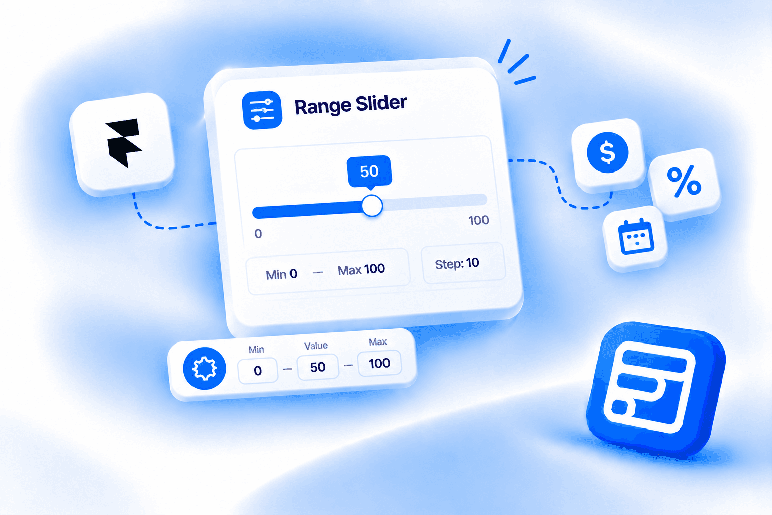
Key Takeaways
- Framer's native form has no range slider field — designers collecting numeric ranges today use dropdowns or text inputs, which this field replaces.
- The three core Slider Settings are Min (default 0), Max (default 100), and Step (default 10). Step controls how the value increments as the visitor drags.
- Default Value (default 50) sets where the slider handle sits when the form loads, before the visitor interacts with it. It is separate from the Min/Max range.
- Every visual element is editable on the canvas: the track (height, background, fill color, radius), the thumb (size, color, border, shadow), and the value display (show/hide, font, color, width).
- Available on Pro and Scale plans, not Basic.
Overview
Framer's native form has no range slider field. Designers who need to collect a budget amount, a satisfaction score, a quantity, or any other numeric value within a known range typically reach for a dropdown with predefined bands or a plain number text input. Both are workable but neither is the right tool. A dropdown forces visitors into artificial buckets. A text input accepts anything, including values outside the range you care about, and requires extra validation to enforce limits. A slider constrains the input automatically and feels more natural for continuous numeric data.
Forms Plugin's Range Slider field closes that gap. It gives visitors a draggable handle to pick a value within a defined Min/Max range, submits that value as a number in the form data, and is fully styleable on the Framer canvas. This post covers what the field's settings panel actually controls, how every visual element is configured, and when a slider is the right choice over a dropdown, a number input, or a rating field. For a broader look at how Framer forms work, the practical guide to Framer forms covers the full picture.
Quick Answer
- Framer's native form has no range slider field. The Range Slider is one of 14 Advanced Fields in Forms Plugin, available on Pro and Scale plans, not Basic.
- The three core Slider Settings are Min (default 0), Max (default 100), and Step (default 10). Step controls how the value increments as the visitor drags — for example Step 1 for whole integers or Step 0.1 for decimals.
- Default Value (default 50) sets where the slider handle sits when the form loads, before the visitor interacts with it. It is separate from the Min/Max range.
- Every visual element is editable on the canvas: the track (height, background, fill color, radius), the thumb (size, color, border, shadow), and the value display (show/hide, font, color, width).
- Unlike upload fields, the Range Slider has no Placeholder, no Sub Text, and no storage options. It collects a number, not a file.
What is the Range Slider field?
It is one of 14 Advanced Fields in Forms Plugin, alongside File Upload, Phone Number, Country, Image Upload, Color Picker, Button Option, Rating, Promoter Score (NPS), E-Signature, Voice Recording, Audio Upload, Video Upload, and URL Source Collector. It collects a single numeric value within a defined range by letting a visitor drag a handle along a track, and that value submits as a number in the form data alongside all other field responses.
The canvas component badge reads "Range Slider." The field panel header reads "Inserting into Range Slider" when selected in the Advanced Fields panel under the "Advance" tab. Field Name defaults to range-slider and Label Name defaults to "Range" — both editable to whatever fits your form's data structure and visible labeling.
One thing worth being direct about: this is a single-thumb slider. It picks one value, not a min-and-max pair. A visitor drags the handle to a position and that position's numeric value submits with the form. If your use case requires a dual-handle range picker where a visitor selects both a lower and upper bound, this field does not do that.
What do the core settings control?
Field Name is the unique identifier that appears in your submitted form data, defaulting to range-slider. Rename it to match whatever key your CRM integration, webhook payload, or email notification expects. Label Name defaults to "Range" and is the visible label above the slider on the form.
Required is a Yes/No toggle, defaulting to No. Unlike text or upload fields, the Range Slider has no Placeholder field and no Sub Text field. Those properties don't apply to a slider, and the panel doesn't include them.
Default Value is a numeric input with its own slider control, defaulting to 50. This is where the handle sits when the form first loads, before a visitor touches it. It functions as the starting position — if a visitor submits the form without moving the slider at all, the Default Value is what submits. Set it to something meaningful for your use case: 25 on a budget slider from 0 to 100 if you want the handle to start in the lower quarter rather than the midpoint.
The Slider Settings sub-panel has three controls. Min sets the lowest value the slider can reach, defaulting to 0. Max sets the highest, defaulting to 100. Step controls the increment as the visitor drags, defaulting to 10. The panel helper text for Step reads: "Step increment (e.g., 1 for integers, 0.1 for decimals)." A Step of 10 on a 0-to-100 range means the slider snaps to 0, 10, 20, 30, and so on. A Step of 1 allows every whole integer. A Step of 0.1 allows one decimal place. Set Step to match the precision the submitted data actually needs.
The Validation sub-panel has two controls. Required Error is a custom message field for when a visitor tries to submit without interacting with the slider and the field is marked Required. It supports {label}, {name}, and {value} placeholders, so the error message can reference the field's own label, name, or current value without hardcoding them. Browser Tooltip is an On/Off toggle, defaulting to Off, described as "Show browser default validation popup. Turn off to display only custom error text."
How do you style the slider?
Every visual element is editable directly on the Framer canvas. The Range Slider has more styling sub-panels than most fields because it has distinct visual components: the track, the thumb, the value display, and the standard label and error controls.
Track Style controls the horizontal bar the thumb slides along. Height defaults to 20px. Background is the unfilled portion of the track, defaulting to E5E7EB (light gray). Fill Color is the filled portion to the left of the thumb, defaulting to 3B82F6 (blue), which gives the track a visual sense of progress as the visitor drags right. Radius defaults to 6, giving the track rounded ends.
Thumb Style controls the draggable handle itself. Size defaults to 20px (the thumb is a circle). Color defaults to FFFFFF (white). Border Width is 2px and Border Color defaults to 3B82F6, matching the track fill so the thumb and filled track read as one visual system. Radius defaults to 6 and Shadow defaults to 0, 1, 3.
Value Display controls the number shown alongside the slider. Show/Hide toggle defaults to Show, so the current numeric value is visible to the visitor as they drag. Font is Inter, Color defaults to 374151 (dark gray), and Width defaults to 20px, described as "Width reserved for value text." That width reservation keeps the slider track from shifting position as the value changes digit count.
Focus Style controls what happens when the thumb receives keyboard focus. Thumb Border color is 2563EB. Thumb Shadow is 0, 0, 0, 3. Thumb Scale is 1.15, meaning the thumb grows slightly when focused, giving keyboard users a clear visual indicator of the active element.
Label Style covers Show/Hide for the label (defaulting to Show), the required indicator character (defaulting to *), label font (Inter), and label color (888888). Layout controls direction (Vertical or Horizontal) and gap (8px). Error Style sets the error text color to DC2626 (red) in Inter.
When should you use a range slider instead of a dropdown or number field?
The right answer depends on what the data actually is and how precisely a visitor needs to specify it.
Slider vs dropdown. A dropdown for "budget: under $1k / $1k-$5k / $5k-$20k / over $20k" forces visitors into preset bands. Someone with a $4,800 budget picks the $1k-$5k band, but you lose the actual number. A slider from $0 to $20,000 with a Step of $500 lets them land on $4,500 or $5,000 directly, and you get the real figure. Use a slider when the value is continuous and the exact number matters to how you act on the data. Use a dropdown when the options are genuinely categorical.
Slider vs number text input. A text input accepts anything. A visitor can type -50, or 99999, or nothing at all. A slider constrains responses to your Min/Max range automatically without needing extra validation rules to enforce the boundaries. Use a slider when you want to guide the visitor into a valid range. Use a number input when the valid range is very wide or genuinely open-ended.
Slider vs rating field. A star rating or NPS field is purpose-built for qualitative feedback on a fixed scale with specific UX conventions: stars for satisfaction, a 0-10 button row for Net Promoter Score. A range slider is for quantitative input where the scale is yours to define: budget amounts, quantities, percentages, timeline lengths. The submitted data type is the same (a number), but the intent and visual convention are different.
What are the real use cases for a range slider field in a form?
The slider earns its place whenever the value is numeric, the range is known, and letting the visitor drag to a number is more natural than typing one or picking from a list.
Budget selector on agency inquiry forms. "What's your project budget?" as a slider from $500 to $50,000 with a Step of $500. Cleaner than a dropdown with arbitrary budget bands and gives you the actual number rather than a range.
Satisfaction and experience scoring on a custom scale. A 0-to-100 satisfaction score on a post-service feedback form, or a 1-to-10 effort score that isn't the standard NPS methodology. The slider makes the scale visually obvious and takes one drag rather than a typed entry.
Quantity selectors. How many seats, licenses, attendees, or units. A slider from 1 to 200 with Step 1 is more usable than a plain number input for moderate, bounded ranges where most visitors fall somewhere in the middle.
Timeline inputs. "How soon do you need this?" from 1 to 52 weeks with Step 1, or "What's your expected project duration?" from 1 to 24 months. More intuitive than asking someone to type a number with no visual frame of reference.
Percentage and allocation inputs. "What share of your current traffic is mobile?" or "What percentage of your marketing budget goes to paid search?" from 0 to 100 with Step 5. The slider makes the 0-to-100 nature of the question visually clear without any extra explanation.
Price target inputs on product intake forms. A form collecting project or product requirements where a target price point matters. A slider from a minimum to a maximum plausible price keeps answers realistic without a dropdown that forces someone into a band.
The through-line: sliders work when the value is continuous, the range has a known floor and ceiling, and guiding the visitor to a specific number matters more than letting them type freely.
Can you add conditional logic to the range slider?
Yes, using the same conditional logic system every other Forms Plugin field uses. The Conditions sub-panel supports five actions: Show/Hide, Required, Read-Only, Disable, and Value Reset. These combine with AND/OR logic and a full operator set: Is Empty, Is Not Empty, Contains, Not Contains, Exact Match (Case Sensitive), Match (Case Insensitive), Starts With, Ends With, Length Greater Than, Length Less Than, and Regex. The Source Field input takes the name of any other field in the form, and Field Type is set to Text, Number, or Date depending on what that field is.
One practical combination: show the Range Slider only when a visitor selects a specific option earlier in the form. A service type dropdown with options like "One-time project" and "Ongoing retainer" could trigger the budget slider to appear only for the "Ongoing retainer" selection. The full rule builder is on the conditional logic feature page, and the conditional logic guide covers the operator details.
What plan do you need?
Pro or Scale. The Range Slider is not included on the free Basic plan. Current pricing is one-time and lifetime — check that page for the current figures. Both Pro and Scale include the field, so the choice between them comes down to how many sites you're running and whether you need the commercial license for client work. The features page lists the full Advanced Fields set alongside everything else included in each plan.
Frequently asked questions
Does Framer's native form have a range slider?
No. Framer's native form component covers standard inputs like text, email, number, phone, and date, but has no range slider field. A slider field in a Framer form requires a plugin. The Range Slider is one of 14 Advanced Fields in Forms Plugin, available on Pro and Scale plans.
What does the Step setting control on the range slider?
Step controls the increment the slider snaps to as a visitor drags. A Step of 10 on a 0-to-100 range means the slider lands on 0, 10, 20, 30, and so on, not any value in between. Step 1 allows every whole integer. Step 0.1 allows one decimal place. Set Step to match the precision your data actually needs.
What is the difference between Default Value and Min/Max?
Min and Max define the boundaries of the slider — the lowest and highest values a visitor can select. Default Value is where the handle sits when the form loads, before the visitor touches it. If a visitor submits the form without moving the slider, Default Value is what gets submitted. It must fall within the Min/Max range but is otherwise independent of it.
Can I style the slider track and thumb to match my Framer design system?
Yes, fully. Track Style controls the bar's height, background color, fill color, and radius. Thumb Style controls the handle's size, color, border width, border color, radius, and shadow. Value Display controls the number shown next to the slider. All of these are standard Framer canvas properties, so the slider inherits your design system the same way any other native component does.
Is the range slider a single-value slider or a dual-handle range picker?
Single-value. The Range Slider has one thumb and submits one number. It picks a point on the scale, not a lower and upper bound. If your use case requires a visitor to select both a minimum and maximum value, this field doesn't cover that. Two separate Range Slider fields (one for minimum, one for maximum) would be the workaround.
Bottom line
Framer's native form has no range slider, so designers collecting numeric input within a known range default to dropdowns or text inputs. Both are worse UX for continuous data. The Range Slider replaces that workaround with a draggable input that constrains responses to your Min/Max automatically, requires no range-enforcement validation, and is fully styleable on the Framer canvas down to the track fill color and thumb focus scale. Available on Pro and Scale, with conditional logic working identically to every other field in the plugin.
Ready to build smarter Framer forms?
Forms Plugin gives you everything covered in this article - natively, inside Framer.
Get Forms Plugin


 Get this Plugin