Key Takeaways
- The field appears as 'Button Option' in the Advanced Fields picker, but the canvas component badge and the field panel header call it 'Button Choice.' The default Field Name is button-choice. Both names refer to the same field.
- Each choice has a Label (the text visible on the button) and a Value (what gets submitted in the form data). They are independent — the button can read 'Small Business' while the submitted value is 'smb'.
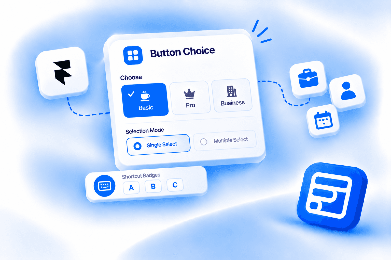
- Choice Settings has two modes: Single (default, one selection at a time, with an optional deselect) and Multiple (visitor picks more than one, with configurable Min Select, Max Select, and a Separator that joins values on submission).
- Shortcut Badges let visitors select options by pressing a keyboard key (A, B, C or 1, 2, 3) when badges are visible — useful for keyboard-navigable forms.
- Available on Pro and Scale plans, not Basic.
Overview
Radio buttons and dropdowns are the default way most forms collect a choice, and both have real UX weaknesses. Radio buttons have small click targets, especially on mobile, and the circular indicator is easy to miss or misclick. Dropdowns hide all options behind a tap, so a visitor has to open the list before they can compare choices. For short option sets where the visitor benefits from seeing everything at once, neither is the right tool. The Button Option field replaces both with large, tappable button elements that display all options simultaneously, each one clearly labelled and visually highlighted when selected.
This post covers the naming difference you'll notice the moment you add the field, how individual choices are configured (and why the label and submitted value are independent), how Single and Multiple selection modes work, what Shortcut Badges do, the full styling system, and when this field is the right choice over a dropdown or radio buttons. For a broader overview of how Forms Plugin extends Framer's native form, the practical guide covers the full picture.
Quick Answer
- The field appears as "Button Option" in the Advanced Fields picker, but the canvas component badge and the field panel header call it "Button Choice." The default Field Name is
button-choice. Both names refer to the same field. - Each choice has a Label (the text visible on the button) and a Value (what gets submitted in the form data). They are independent, so the button can read "Small Business" while the submitted value is "smb."
- Choice Settings has two modes: Single (default, one selection at a time, with an optional deselect) and Multiple (visitor picks more than one, with configurable Min Select, Max Select, and a Separator that joins values on submission).
- Shortcut Badges let visitors select options by pressing a keyboard key (A, B, C or 1, 2, 3) when badges are visible — useful for keyboard-navigable forms.
- Available on Pro and Scale plans, not Basic.
What is the Button Option field?
It is one of 14 Advanced Fields in Forms Plugin, alongside File Upload, Phone Number, Country, Image Upload, Range Slider, Color Picker, Rating, Promoter Score (NPS), E-Signature, Voice Recording, Audio Upload, Video Upload, and URL Source Collector. It gives visitors a set of clickable button-style elements to select from, replacing the small click targets of radio buttons and the hidden option list of a dropdown with large, always-visible buttons.
The naming is worth addressing before anything else. In the Advanced Fields picker tile inside the plugin, the field is labelled "Button Option." Drop it onto the canvas and the component type badge reads "Button Choice." Open the field settings and the panel header also reads "Button Choice." The default Field Name value is button-choice. Same field, two names depending on where you're looking — consistent with how Forms Plugin handles naming on several of its Advanced Fields.
Three choices ship by default when the field is inserted: Option 1 with submitted value option-1, Option 2 with option-2, and Option 3 with option-3. Label Name defaults to "Choose" and is the visible label above the button group on the form.
What do the core settings control?
Field Name is the unique identifier that appears in your submitted form data, defaulting to button-choice. Rename it to match whatever key your CRM integration, webhook payload, or email notification expects. Label Name defaults to "Choose" and is the visible label above the button group.
Required is a Yes/No toggle, defaulting to No. Default Value is an empty field with helper text: "Pre-selected value(s). Use separator for multiple." If you want one button to appear already selected when the form loads, enter that choice's Value string here. For Multiple mode with a pre-selected combination, enter the values separated by the same Separator character configured in Choice Settings.
The Choices system is where the field's content lives. Each choice item in the list has three properties. Label is the visible text that appears on the button itself, for example "Option 1." Value is the string submitted in the form data when that button is selected, described in the panel as "Data sent when submitted," for example option-1. Image is an optional uploadable image that can appear above or below the label text on the button. Label and Value are fully independent. The button can display "Enterprise" while submitting enterprise-tier as the value, or display "I'm a freelancer" while submitting freelancer. What the visitor reads and what your CRM receives don't have to match. Add more choices via the "Add..." control at the bottom of the list.
The Validation sub-panel has a Required Error custom message field and a Browser Tooltip toggle (defaulting to Off). Required Error supports {label}, {name}, and {count} placeholders, so the message can reference the field's label, its name, or the number of selections made. The {count} token is specific to this field and is particularly useful in Multiple mode where you need to communicate a minimum or maximum selection count in the error text. Browser Tooltip, described as "Show browser default validation popup," defaults to Off, meaning only your custom error message appears and not the browser's native popup alongside it.
How do Single and Multiple selection modes work?
Choice Settings is the sub-panel that controls selection behavior, and it has two modes with meaningfully different properties.
Single mode is the default. A visitor can select one option at a time. Selecting a different button deselects the previous one automatically. Allow Deselect is a Yes/No toggle (defaulting to Yes), described as "Click selected to deselect in single mode." With Allow Deselect On, clicking the already-selected button deselects it, returning the field to an unselected state. With it Off, once a visitor selects a button they cannot deselect it without selecting a different one. The submitted value is the Value string of whichever choice is selected at submission.
Multiple mode allows a visitor to select more than one option. Switch Selection to Multiple and three additional controls appear. Separator defaults to , and is described as "Joins multiple values in submission," meaning if a visitor selects the choices with values option-1 and option-3, the submitted value is option-1,option-3. Change the Separator to a different character if your downstream integration expects a different delimiter. Min Select defaults to 0, described as "Minimum selections required (0 = none)." Set it to 2 if at least two selections are required before the form can submit. Max Select defaults to 0, described as "Maximum allowed selections (0 = unlimited)." Set it to 3 to cap selections at three, after which additional buttons become unclickable until an existing selection is removed.
The {count} token in the Required Error message becomes useful here. An error like "Please select at least {count} option(s)" can dynamically reference the Min Select value rather than hardcoding the number.
How do Shortcut Badges work?
Shortcut Badges are a distinct feature of this field with no equivalent in standard radio buttons or dropdowns. The Shortcut Badges sub-panel has a Show/Hide toggle (defaulting to Hide). When set to Show, each button displays a small badge — either alphabetic (A, B, C) or numeric (1, 2, 3) — depending on the Badge Style setting.
Key Shortcut is an On/Off toggle (defaulting to On) described as "Press badge key to select option." When badges are visible and Key Shortcut is On, a visitor can press the corresponding keyboard key to select an option without clicking or tapping. Press A (or 1) to select the first option, B (or 2) for the second, and so on. This is useful for forms designed for keyboard navigation, power-user interfaces, or any context where reducing interaction friction matters. A qualification form used by a sales team, for example, could be navigated entirely by keyboard with Shortcut Badges visible.
How do you style the buttons?
Every property is editable directly on the Framer canvas. The Button Option field has more styling sub-panels than most fields because it has a distinct visual system for the inactive and active states of each button, plus image and layout controls for the button group.
Button Style is the core visual panel. Padding defaults to 10 (applied uniformly). Radius defaults to 10. Border Width is 1px. Font is Inter. Inactive BG is F3F4F6 (light gray), Inactive Text is 6B7280 (medium gray), Inactive Border is 000000 (black). Active BG is 3B82F6 (blue), Active Text is FFFFFF (white), Active Border is 3B82F6 (matching the active background). Checkmark is a Show/Hide toggle (defaulting to Show) that controls whether a checkmark icon appears on the selected button.
Image Style controls the optional image per choice. Show/Hide defaults to Show. Position Text controls whether the label text appears above or below the image, defaulting to Above. Height is 120px. Radius is 6. Spacing defaults to 10px, described as "Space between image and text."
Button Layout is the second Layout panel in the settings (distinct from the label-to-field Layout). Type toggles between Stack and Grid. Direction is Horizontal or Vertical. Distribute defaults to Start. Wrap is a Yes/No toggle (defaulting to No), controlling whether buttons wrap to a new line when they exceed the container width. Gap defaults to 10px between buttons. Padding defaults to 0 on the button group container.
Focus Style controls interactive states. Hover Border defaults to 3B82F6 (matching the active blue). Active Shadow is Mixed.
Label Style (the label above the button group) covers Show/Hide (defaulting to Show), the required indicator character (defaulting to *), label font (Inter), and label color (888888). The label-to-field Layout controls direction (Vertical or Horizontal) and gap (8px). Error Style sets error text color to DC2626 (red) in Inter.
When should you use Button Option instead of a dropdown or radio buttons?
Button Option vs dropdown. A dropdown hides all its options until a visitor clicks or taps to open it. The visitor cannot compare choices without interacting first. Button Option shows every choice simultaneously as tappable buttons, which is better when the options are few enough (typically 2 to 6) that displaying them all at once is practical and comparison is part of the decision. Use a dropdown when there are many options — 10 or more — where showing them all as buttons would clutter the form layout.
Button Option vs radio buttons. Radio buttons work but have small click targets, particularly on mobile, and the circular indicator with a text label beside it is a visually minimal pattern. Button Option provides larger tap targets, a more polished visual appearance, and inherits your design system's typography and color through the canvas styling controls. Use Button Option when visual clarity and tap-friendliness matter more than conserving vertical space.
Button Option (Multiple mode) vs checkboxes. Checkboxes are fine for long lists where vertical scanning is natural. Button Option in Multiple mode works better for short, visually distinct option sets where seeing all options simultaneously helps the visitor make faster decisions. A "Which days work for you?" question with 5 days as buttons is faster to interact with than 5 checkboxes in a column, and the active state makes selected options more visually obvious. For more on validation of minimum and maximum selection requirements, the validation guide covers how to enforce those rules across field types.
What are the real use cases for the Button Option field in a form?
The field earns its place when there are a small number of distinct choices, showing all of them at once helps the visitor, and tap-friendliness matters.
Service type selection on inquiry forms. "What are you looking for?" with buttons like "Website," "Branding," "SEO," and "Ads" in Single mode. The visitor taps one, it highlights, and conditional logic can then show or hide downstream fields based on the selection.
Plan or tier selection. "Which plan fits you?" with buttons for Free, Pro, and Scale. Three options shown side by side as buttons is faster to read and more visually engaging than a dropdown that hides the options. Pair with images per choice for a more visual plan comparison.
Availability and preference selectors. "Which days work for a call?" with day buttons in Multiple mode, Min Select 1, Max Select 3. The visitor picks as many as apply and the submitted value joins them with the Separator character for clean downstream processing.
Onboarding qualifier questions. "What best describes you?" with role buttons: Designer, Developer, Marketer, Founder. Single mode with Allow Deselect Off so the selection is locked once made. The selected value drives conditional logic that routes the visitor through different form paths depending on their role.
Product configurators with images. Size, finish, or variant selection where each option has a product image. The Image per choice property makes this work for visual selection, where seeing the option matters more than reading a label. A "Choose your color" selector with a swatch image per button is cleaner than a dropdown.
Short survey questions. Multiple choice questions where showing all options as buttons is cleaner than a radio button column. Particularly useful on mobile where button tap targets outperform small radio circles.
The through-line: 2 to 6 options, comparison benefits from seeing them all at once, and the interaction is a tap rather than a scroll-and-select.
Can you add conditional logic to the Button Option field?
Yes, using the same conditional logic system every other Forms Plugin field uses. The Conditions sub-panel supports five actions: Show/Hide, Required, Read-Only, Disable, and Value Reset. These combine with AND/OR logic across a full operator set: Is Empty, Is Not Empty, Contains, Not Contains, Exact Match (Case Sensitive), Match (Case Insensitive), Starts With, Ends With, Length Greater Than, Length Less Than, and Regex.
The most practical combination for this field: use the selected button value to show or hide subsequent fields. If a visitor picks "Enterprise" from a plan selector, show a "Company size" slider that stays hidden for all other selections. The Value string submitted by the selected button is what the condition watches, so naming Values clearly and consistently (rather than leaving them as option-1, option-2) makes conditions easier to read and maintain. The conditional logic feature page has the full rule builder, and the conditional logic guide covers the operator details.
What plan do you need?
Pro or Scale. The Button Option field is not included on the free Basic plan. Current pricing is one-time and lifetime — check that page for the current figures. Both Pro and Scale include the field, so the choice between them comes down to how many sites you're running and whether you need the commercial license for client work. The features page lists the full Advanced Fields set alongside everything else included in each plan.
Frequently asked questions
Why does the field show "Button Choice" on canvas but "Button Option" in the picker?
The Advanced Fields picker tile uses "Button Option" as the display name. Once the field is dropped onto the canvas, the component badge reads "Button Choice," and the field panel header also reads "Button Choice." The default Field Name value is button-choice. All of these refer to the same field. Forms Plugin does this with more than one Advanced Field, so if the label shifts depending on where you're looking, that's expected, not a sign that a different component was added.
What is the difference between a choice's Label and its Value?
Label is the text that appears on the button face, visible to the visitor filling out the form. Value is the string that gets submitted in the form data when that button is selected, described in the panel as "Data sent when submitted." They are independent. A button can display "I'm a freelancer" as its Label while submitting freelancer as its Value. Keeping Values short, lowercase, and consistent makes CRM field mapping and conditional logic rules easier to manage.
Can visitors select more than one button option?
Yes, by switching to Multiple mode in the Choice Settings sub-panel. Multiple mode adds a Separator (defaulting to ,), Min Select (defaulting to 0, meaning no minimum), and Max Select (defaulting to 0, meaning unlimited). The submitted value joins all selected Values with the Separator character. Single mode is the default and restricts the selection to one choice at a time.
What do Shortcut Badges do?
Shortcut Badges display a small A, B, C or 1, 2, 3 badge on each button. When the Key Shortcut toggle is On (the default when badges are shown), pressing the corresponding keyboard key selects that option without clicking. Badges are hidden by default and are most useful for keyboard-navigable forms or any interface where reducing interaction friction matters.
Can I add images to each button option?
Yes. Each choice item in the Choices list has an Image property that accepts an uploadable image. Image Style controls whether that image appears above or below the label text (defaulting to Above), the image height (120px), corner radius (6), and the spacing between the image and the label text (10px). The image is optional per choice, so some buttons in the same group can have images and others can have label text only.
Bottom line
Button Option replaces radio buttons and dropdowns for short option sets where showing all choices at once improves the decision experience. The naming difference between picker ("Button Option") and canvas ("Button Choice") is cosmetic — they're the same field. Single mode covers standard one-choice selection, Multiple mode adds selection count controls and a configurable Separator for the submitted value. Shortcut Badges add keyboard selection for forms where that matters. Every visual property — inactive and active button states, image position, button layout — is editable on the canvas. Available on Pro and Scale, with conditional logic working identically to every other field in the plugin.
Ready to build smarter Framer forms?
Forms Plugin gives you everything covered in this article - natively, inside Framer.
Get Forms Plugin


 Get this Plugin